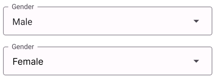
Select Attribute
How to use in JSON metadata in form builder:
{
    "id": "select",
    "new_id": "gender",
    "is_standard": true,
    "editable": true,
    "display_order": 5,
    "select_icon": "menu-down",
    "label": "Select field",
    "input_type": "SELECT",
    "input_options": [],
    "placeholder_text": "Placeholder",
    "initial_value": "",
    "background_color": "primary.300",
    "mode": "outlined",
    "validation_rules": {}
  }
Properties of select attribute:
| # | Attribute | Default | Description |
|---|---|---|---|
| 1 | id | select | This value won't change! |
| 2 | new_id | New attribute id to use in form | |
| 3 | is_standard | true | |
| 4 | editable | true | Allows user to edit the input field |
| 5 | display_order | 1 | Allows user to define the order of the fields |
| 6 | select_icon | menu-down | Helps to add icon to the field eg: iconName from vector Icon (https://pictogrammers.com/library/mdi/?welcome) |
| 7 | label | Select field | Used to specify the label of the field |
| 8 | input_type | SELECT | Base attribute which specifies input types. (no need to change) |
| 9 | input_options | [] | Here you have to specify about the option you need in dropdown |
| 10 | placeholder_text | Placeholder | Placeholder temporarily takes the place of the final data |
| 11 | initial_value | " " | It defines the initial value in the input field |
| 12 | background_color | white | Theme colors can be used here. e.g. primary.100 or red.300 |
| 13 | mode | outlined | 'flat' or 'outlined' Check mode value from https://callstack.github.io/react-native-paper/docs/components/TextInput/ |
| 14 | validation_rules | https://react-hook-form.com/get-started#IntegratingControlledInputs -> rules |